Valentine's Day
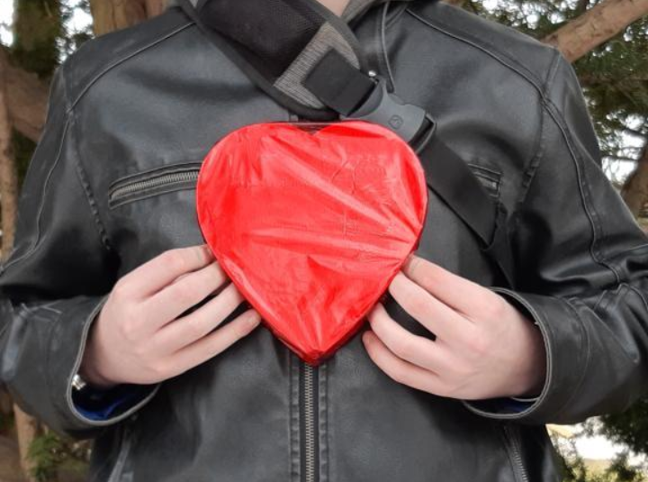
For YouI know that center focused pictures are usually static and boring but I actually really like the close contrast between the red and black of the coat. This picture was supposed to be shallow depth of field with the heart in main focus but its hard to do on a phone camera.
|
|
|
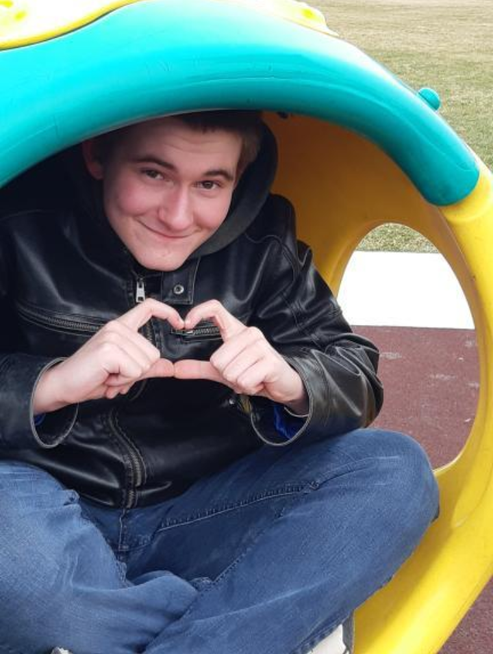
I Love You :3I enjoy the contrast of this photo and the bright colors mixed with a smile and a heart all are very positive and nice. You immediately look at Ryan's face, then his hands, then the arm goes down to the hole in the ball which rounds right back up to Ryan's face. A nice little photo that I think is playful and charming.
|
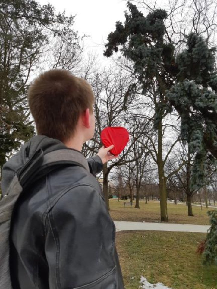
To Love or Not to Love?I tried to make a triangular composition in this photo with the tree going diagonally. You look at the heart because of the color first, then the tree leads you up and points to Ryan who is looking at the heart. I like the color contrast with the dark green tree and the red heart box.
|
|
Photo Essay
Good Morning
The overall start to my day always has to begin with me waking up. I choose to take the picture around mid day because I usually wake up later than 12 during this time. I decided to have the picture taken from above because its the angle at which the sun is coming into my room. Dead pool and alien are there to fill the void, bring more contrast into the picture and balance the weight. Most of the weight is on me, my face is the lightest and stands out against all of the other colors in the picture. To get this angle I actually had to tap a cloth to my phone and then to the window so my phone could lean over my window sill at a downwards angle.
Banana Toast Brunch
Because its only me and my dad in the house and we have limited food items I have found myself eating only peanut butter toast, bananas and peach juice for brunch. I usually wake up after 12 and have this for brunch, I have stopped counting how many days I have done this.I choose to include the peach juice solely so the image was not over saturated with browns and yellows. The bright light from the window indicates its around mid day and brings your attention to the food instead of the darker in the shadows background. I feel like I could have angled this better and maybe put more things in the middle ground to balance it out.
Gamer Set Up
By the time I decide to do anything it has usually gone pretty dark because I wake up so late in the day. I choose to take the picture so far away from the desk to give it a sense of free flow, its not to claustrophobic. My chair takes up alot of the weight of the photo and the desk takes the other half. The chair is only black and white while the desk is many different colors so your eyes usually ease towards the chair. I took the photo of my set up because I usually play alot of video games at my desk that takes up the bulk of my day.
Late Night Walk
My dad heavily enforces that I take a walk everyday because i'm in the house most of the day. So I took a picture of me walking down my street on the sidewalk. I took the picture from below because I wanted to give the streetlights a lot of attention. When I go out for the walk the streetlights are usually blinding and take up a lot of my attention. I also feel really calm when taking these walks so I wanted the nice blue sky fading into dark blue to be prevalent in this photo. This picture also shows the passage of time with the sky being very dark and my frame being lit only by the streetlights and contrast with the sky. You can see i'm still wearing my pajamas as well, I usually dont bother with taking my pj's off some days just because I am lazy. Me and the streetlight take up the weight of the photo.
Actually Time to Work
Once I have taken my walk and had dinner of some sort I often now have limited time late at night to finish school work. This photo is lit only by my room light and is very claustrophobic and tight on my computer. That's exactly how I feel late at night panicking over work that I have neglected till then. The warm colors mixed with the dauntingly bright light reflecting off of my laptop is exactly how I feel, tired and regretful. The many Pepsi's next to my laptop also show off my unhealthy diet during the quarantine. My laptop takes up most of the weight of this photo while my pop cans, to do list, and pop figurines also catch the eye. I edited the photo to loo unnaturally lighter to make the sleepy artificial light more prevalent. I gave y pop figures lighter highlights and darker shadows to they stand out more in the background.
Late Night
When I have finally decided to get some rest it is usually very late at night and undeserved. I keep my light on because i'm afraid of the dark and I also wanted myself to be visible in the photo. Fun fact I actually sleep face down but I wanted to get my face in the photo. I took the photo from an upward angle so you could see the dark abyss in my window and contrast the downward angle of my waking up. I took this photo from my gaming chair and help my phone up with a book. I held dead pool to give the foreground more weight as well as the three boxes on the bottom to make the photo more grounded.
Spring Photography
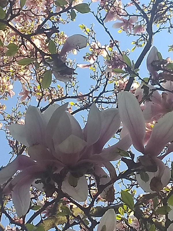
Under the PetalsI tried to take the advice from the website about not taking the photos at eye level, so I took an upward photo of a tree. I enjoy the contrast of the light blue sky with the whites and pinks of the petals as well as the dark brown and greens of the branches/leaves. I also liked the shadowy petals in focus contrasting with the lighter petals in the background. The mesh of dark branches and leaves in the bottom row take up space and the soothing smoothness of the petals in the second row of boxes are different to the more spaced out last row of boxes. I thought the colors in general were nice and calm like a breath of fresh air. I made the two flowers in the middle focused as the top row of boxes were unfocused to make the middle flowers more of a focus.
|
|
|
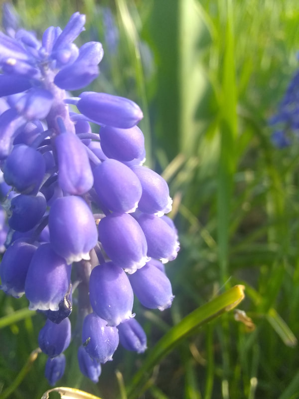
Purple BellsI weighted this one heavily on the left three boxes horizontally. It slowly fades to the middle three boxes but the last three are unfocused. I enjoy the nice distinction between dark and light tones in this picture and you can clearly tell where the light is coming from. You can see the details of the flower very clearly and the texture of it being so smooth and soft. The flow of the picture is dictated by the petals facing downward and the grass pointing upwards. I feel like the whites and purples contrast nicely with the green to make the flower really stick out.
|
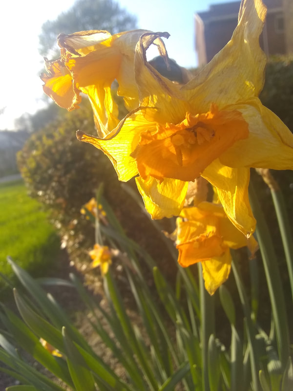
Withered BeautyI tried to make it so that all of my photos were weighted differently, the first one was focused on the middle three boxes vertically, the second was three boxes on the left horizontally. This one I tried to make the weight split diagonally from the bottom right up to the top left. The top right half is weighted with bright yellow in focus flowers to catch your attention. The other half is out of focus grass and bushes. I wanted to show some flowers that were not smooth and round as well, this flower you can clearly see its age with the wrinkled and curled petals as well as the brown on the tips of its petals curling in on itself slightly. Where the other pictures had a smooth gradient or distinction in the highlights and shadows, this picture differs. The glaringly bright petals dont slowly glide into each other, rather they are like solid colors next to each other.
|
|
Patterns
|
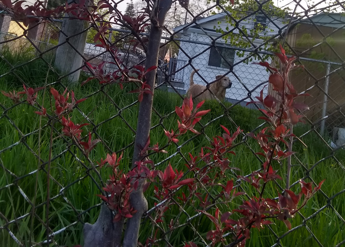
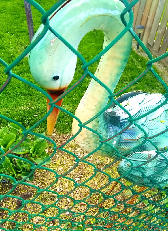
Trapped DogI like how the whole picture is filled with chain link fence. The red leaves are nice contrast for the grass and the dog. The leaves would take up all of the attention if it were not for the dog in the background. The white house in the background highlights the dog well and its face is peaking through one of the links of the fence.
|
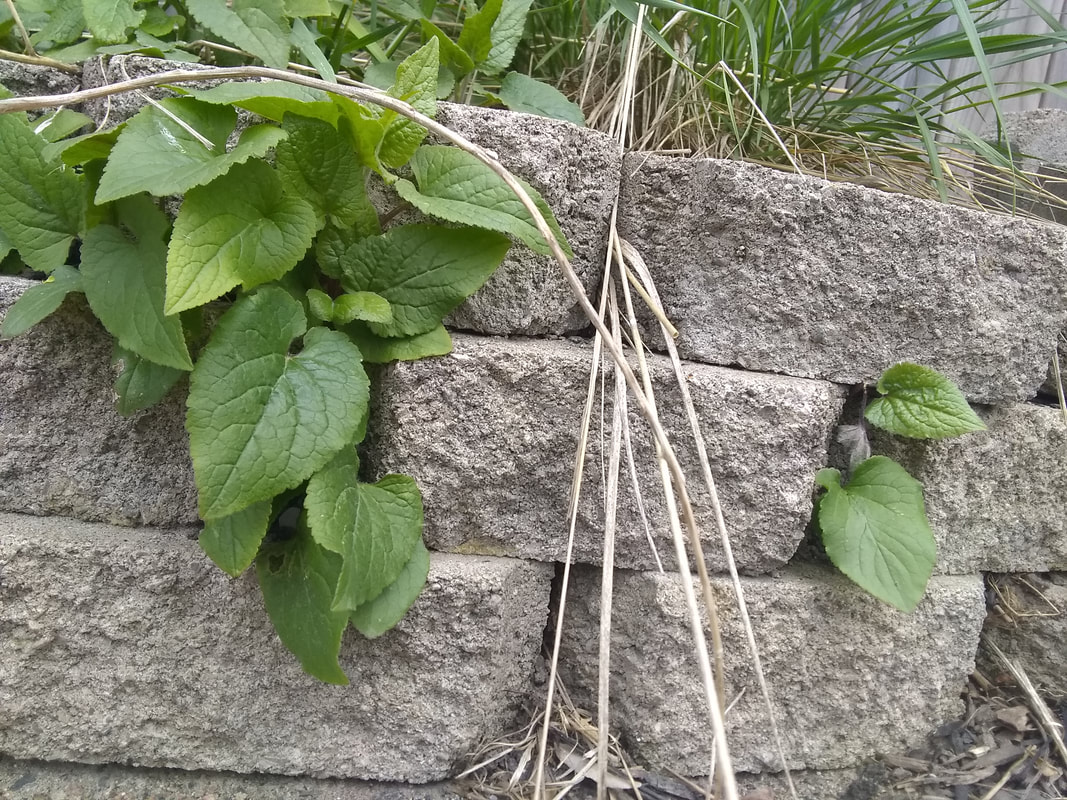
Some BricksI enjoy the lighter and livelier feeling the green of the leaves and grass gives to the gray and rough bricks. A pile of bricks on the side of an alley way semi taken over by plant life. The horizontal lined pattern of the bricks is simple but looks nice.
|
|
|
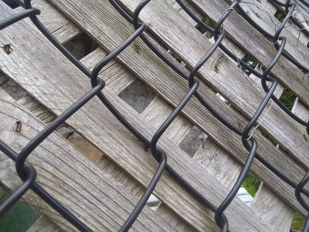
Chain Link FenceThis simple picture of a chain link fence overlapping a wooden fence is nice. Not complex or interesting really just some fences in mid day lighting. I tried to put the top two corners of the middle box on the links of the fence in the middle to make it looks more balanced.
|
Photo Scavenger Hunt
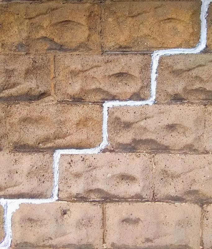
Leading LinesI was having trouble finding something for leading lines until I walked upon this strangely cemented wall. I find that the simplicity in color and angle just adds to the easy path your eye takes in this photo. I made sure to bring the color of the bricks out more to heighten the contrast between the staircase and the bricks. I made the shadows and blacks darker as well to make the bricks look almost two dimensional as the line looks almost one dimensional to add to the contrast. I increased the strength of the whites and exposure so the line stands out even more.
|
|
|
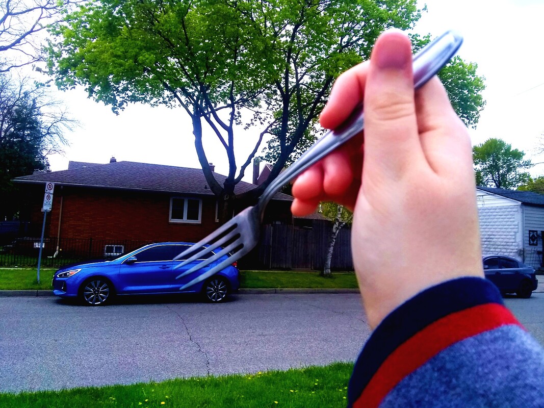
Forced PerspectiveI had so much trouble editing this as well as actually taking it. I'm most disappointed with this photo mostly because I did the forced perspective photo shoot later on and did much better with those. But I do find it humorous walking around with a fork pretending to eat cars, I will admit I couldn't stop laughing to myself. I tried to bring out the blue of the car but and the fork but the fork just blended into the car and background. My hand ended up catching a lot of light and ended up being where my eyes usually go. So this picture is ok but I definitely could have done better.
|
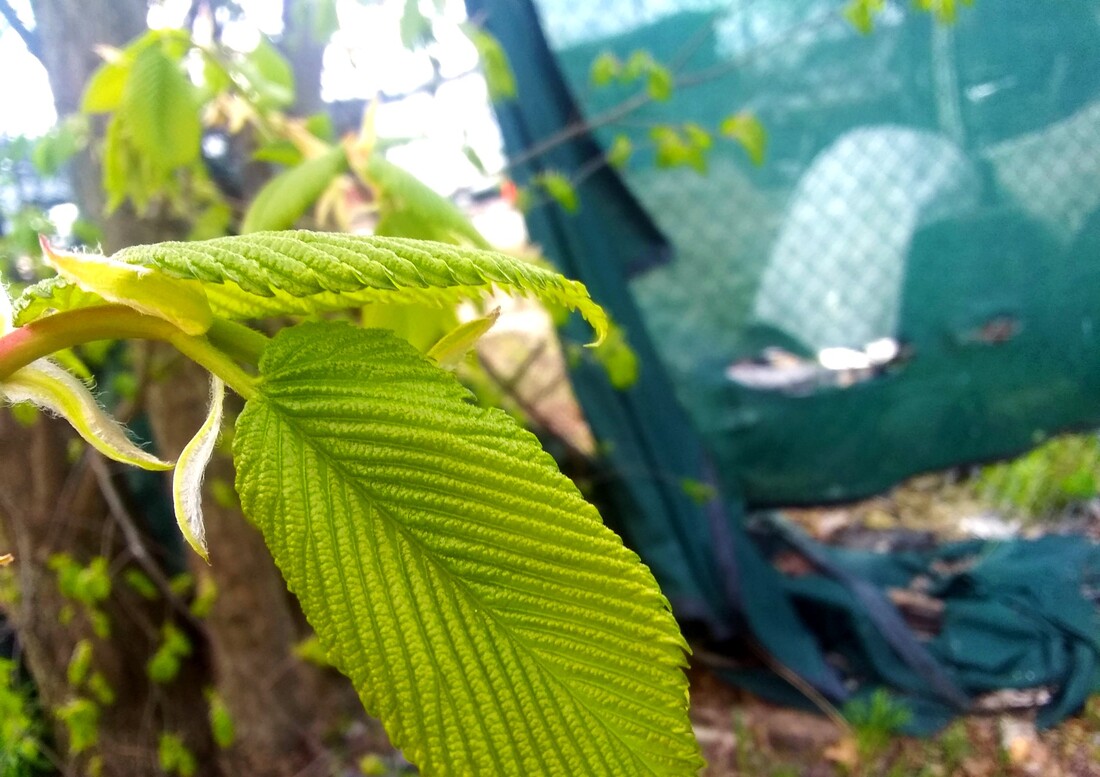
LeafWhile I do enjoy the color of the tarp in the background I feel like the color and placements of the leafs in this photo is clunky. I tried to gave the leaves a shallow depth of field but one of the leaves is cut off near the end and is just weird to focus on, especially with the light difference between the leaves. I edited the vibrancy and saturation to try and help the leaves look more pleasing to the eyes. I also tried to sharpen the leaves to bring out their details but they just loo weird to me. I am learning from my mistakes.
|
|
|
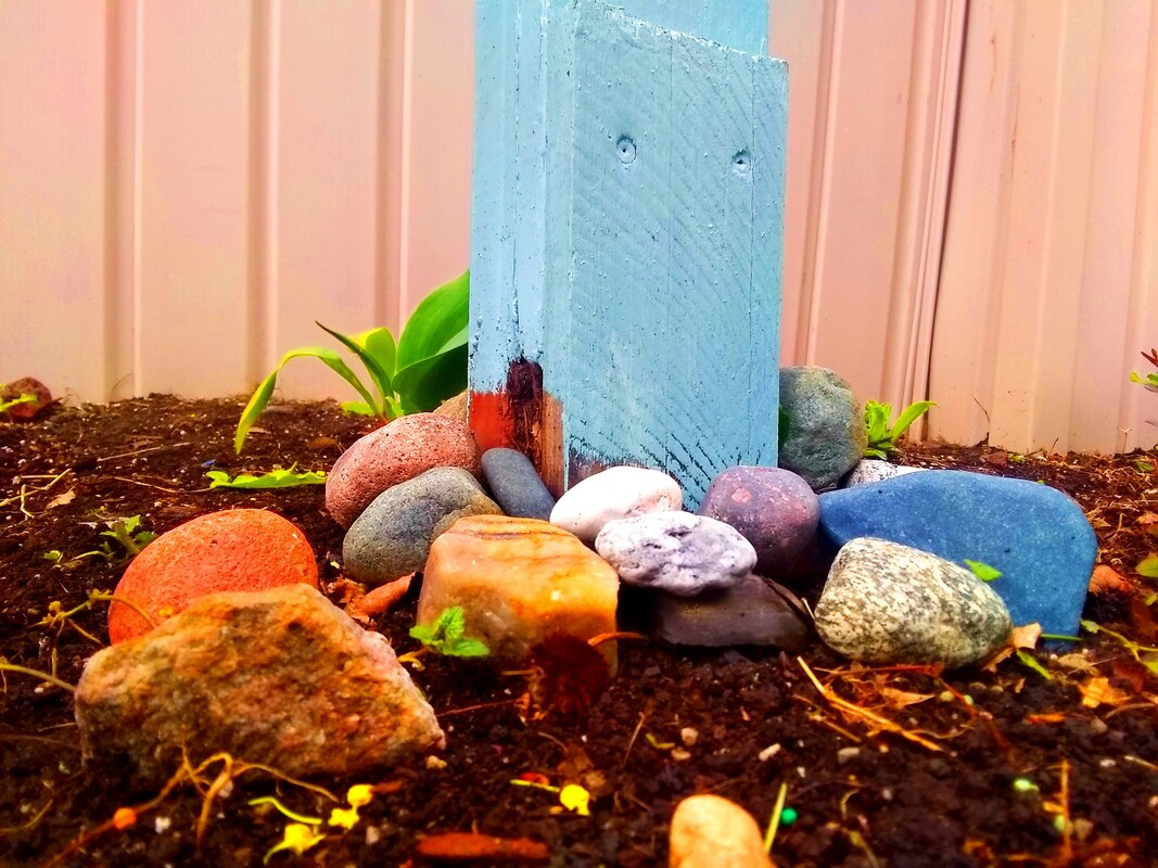
Colorful RockNever knew people put rocks in their front yard but boy am I glad this person did, colorful ones at that. I did not quite center focus this because I know center focused things are usually static and boring so I slightly skewed and grounded the photo so the main focus is the blue pillar and the rocks. I brought the color in the pillar rocks and dirt out and dialed up the shadows and light for more contrast. I hope I did not over edit this I quite like it myself.
|
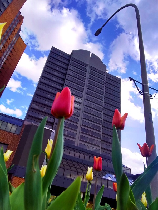
Tall Looking UpOne of my better edits overall. I had to lay down on the ground for this one, took a bit to line up the streetlight with the building and flowers but it was definitely worth it. I adore the color diversity and contrast in this picture. The little bits of red, yellow and green with the blue grey and brown is pleasing and well rounded. I enjoy the diversity in lines in this as well, the curve of the street lights, the jagged straight lines of the building and the smooth leaves and flower buds. The lighting and angle help get nice blue from the sky as well. Definitely a favorite out of the pictures I have taken for this assignment.
|
|
|
Small Looking DownFor some reason I really like the glossy look of the flower petals compared to the grass. I tried to get the inside of the flower while also keeping the flower in composition along the 2/3 line for the rule of thirds. The red on green with freckles of blue is a nice color palette. I tried to bring out the yellow on the inside of the flower for more contrast but at least the other colors looks nice and smooth. Especially the red. I enjoy how the petals curve and look at this angle.
|
An AnimalI tried many times to take a picture of birds in my area and even a cat once but they were all to far or ran away to fast. So I found this guy and he looks pretty cool. I put the its black eye in the center of one of the middle boxes corners to help with the rule of thirds composition. I centered it through one of the fences links as well to make it stand out a bit more. Lots of green in this photo now that I notice. The yellowish beak and black eye stand out nicely. I just tried to bring out the colors in the editing, I raised the exposure as well for more detail on its surface.
|
|
|
Nature SelfieOther than trees and alleyways my neighborhood is not completely "lush" with nature and greenery. Although there is one alley way in particular next to a park in my area with a large amount of overgrown grass and bushes. I decided to just take a picture in that alleyway. Incredibly green and there was trees growing into the fence. Not the best time of day to take it because the sky is a void of white but the greens and my grown hair do contrast nicely. All I did way pump up the contrast and vibrancy, tried to fix the sky, it was a fruitless effort.
|
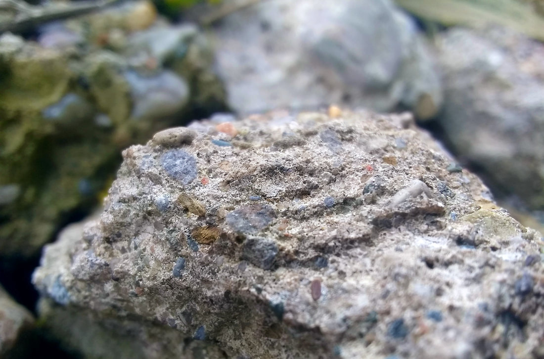
RoughI thought what the roughest thing in the area would be and I found this gathering of rocks in the alleyway behind my house. I choose this angle so you can see all the details on the rock and really get an idea of the texture the rock has. I tried to center the top of the rock around the 2/3 mark for the rule of thirds to keep it balanced. I gave the center rock focus for some shallow depth of field to greater focus on the rocks texture. I pulled the color from the little bits of the rock by heightening the vibrancy and contrast.
|
|
|
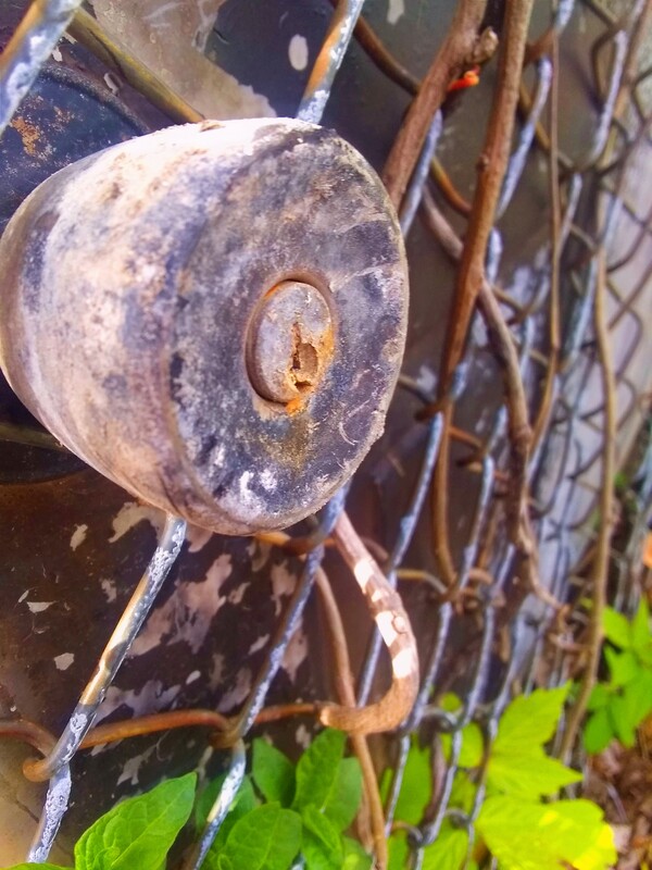
RoundI enjoy the texture and color contrast in this photo. I found a door in a fence in an alleyway and could not resist. I tried to focus on the round doorknob of the fence door. I still gave it some breathing room for the composition though so there is more to look at than just the rusty doorknob. The refreshing greens and grays contrast coolly with the rustic browns. I sharpened the doorknob and tried to darken the round middle area. I sharpened some fence around it as well while leaving the rest of the fence and leaves slightly blurry but not completely out of focus.
|
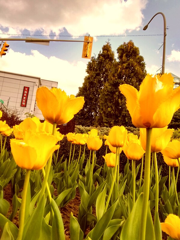
Favorite ColorOne of the most aesthetically pleasing ones. I lined the flowers up front with the 2/3 line for the rule of thirds compositions. I waited to take this picture till around close to when the sun was going to set to put a warmer feeling into the lighting. The contrast of the dark green trees and blue sky with the yellow flowers is nice. While editing I took the advice of the scavenger hunt and put a yellowish tint to the photo the help push the color further. The flood of yellow lowers helps that the most though.
|
|
|
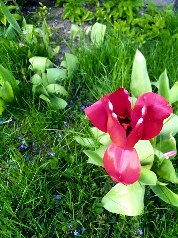
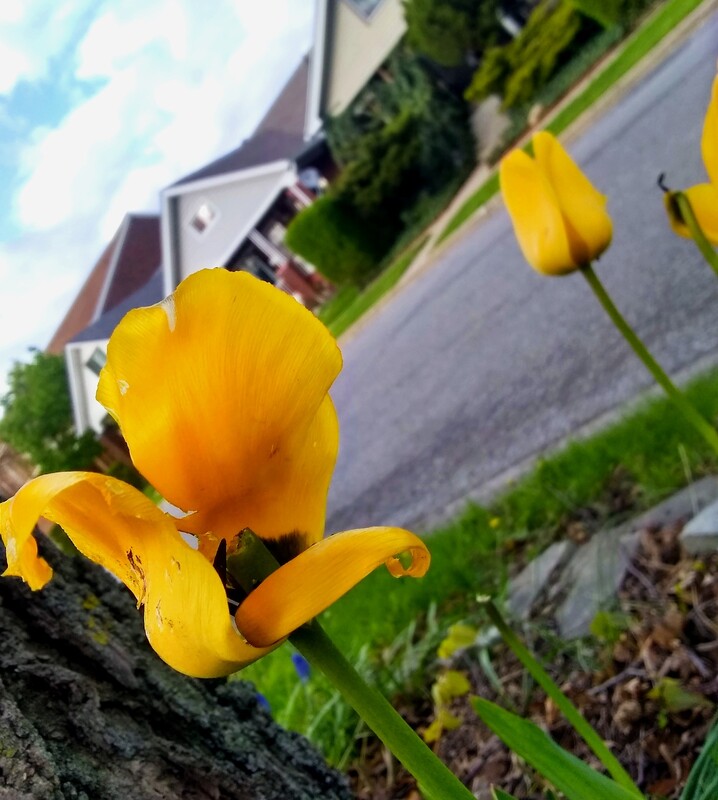
Nature Letter WCurious enough this tulip was going to be the letter c until the back petal curled backwards in the wind. Also I was having the most trouble with this prompt because I wanted so badly to not just take a picture of a tree for a y and call it quits, I wanted to be more creative with it. I took it at this angle because I enjoy getting close and personal with small things so I can better shoot the details, also it helps see the letter I found. I choose to have the back tulip line up with the sidewalk to have a better composition. The yellow tulip stands out among the grey blue and greens of the photo. I had a slight shallow depth of field with the letter tulip being the object most in focus, it helps identify the w. I did not edit this much but I did brighten the whites and exposure. I also lifted the contrast and vibrancy to make the greens and blues more colorful.
|
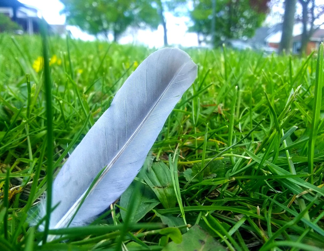
FeatherI am glad I came across a random feather in the grass on my hunt. I tried to add more shadow to the feather and make the grass more vibrant to greater contrast the feather. Not a lot with this picture its just a feather really.
|
|
|
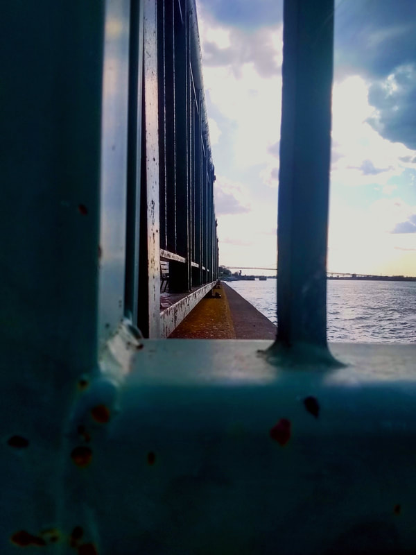
WaterI was going to face this picture towards the water more but I had the idea of lining up the side of the fence at a cool angle. This picture I think holds a nice feeling of being near the water and looking along it. While editing I couldn't bring out the blues of the sky and water as much as I wanted to but I managed to make the photo look more rustic and befitting of the time of day it was taken. I quite like the aesthetic of the picture I should have tried to angle it in a way that it would have been easier to draw out the blues in the water, I just liked the look of the composition to much.
|
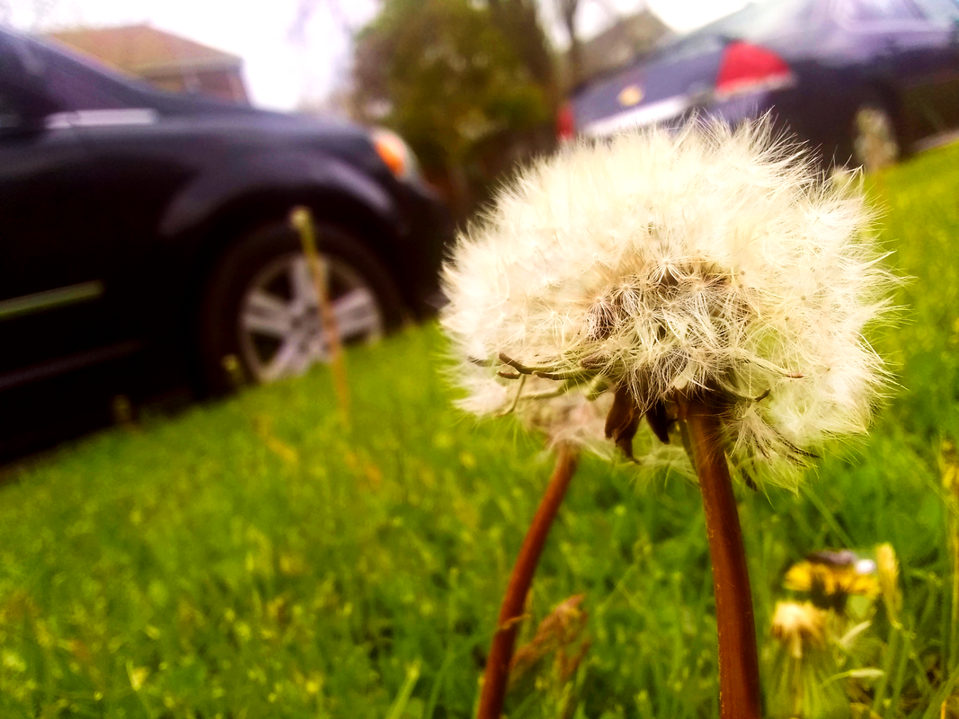
Dandelion SeedI personally think this is one of the better pictures I have taken and edited. Simple, weighed nicely, warm color contrast. All I did was up the contrast and vibrancy and make sure the dandelions were in focus the most. I enjoyed editing and taking this one.
|
|
|
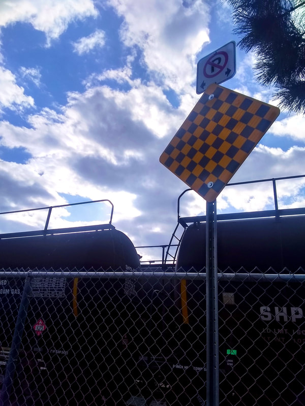
NoisyOne of the first things that came to mind was a car for this prompt but then I remembered that I live right next to trains and they are ungodly noisy in the mornings. The greater depth of field with the sky, train, fence and sign is pleasing. the limited colors and contrast between the dark train and white clouds is pleasing. I lined up the fence at the 1/3 mark to better help with the composition and rule of thirds. The angle also puts it in a human perspective. I tried to further contrast the clouds and the train in editing and make the yellow sign stand out as well. Overall an ok photo that I like the contrast of. Although I do think trains should be a bit more quiet at 4 am.
|
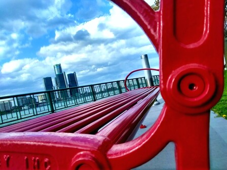
Beautiful SceneI gave this picture a greater depth of field so the buildings in the background are noticeable. When I saw this red bench downtown I had to take a picture of it. The angle was nice, I have to admit I like taking pictures of things from a low close angle. I lined up the end of the bench with the fence and that looks nice. when your eyes are done following the lines of the red bench the curved lines point you to the buildings in the background. I like the contrast with the green, blue and red. I tried to bring out colors of the fence and sky by increasing the vibrancy and saturation as well as exposure. I made the temperature cooler as well so it looks crisper.
|
|
|
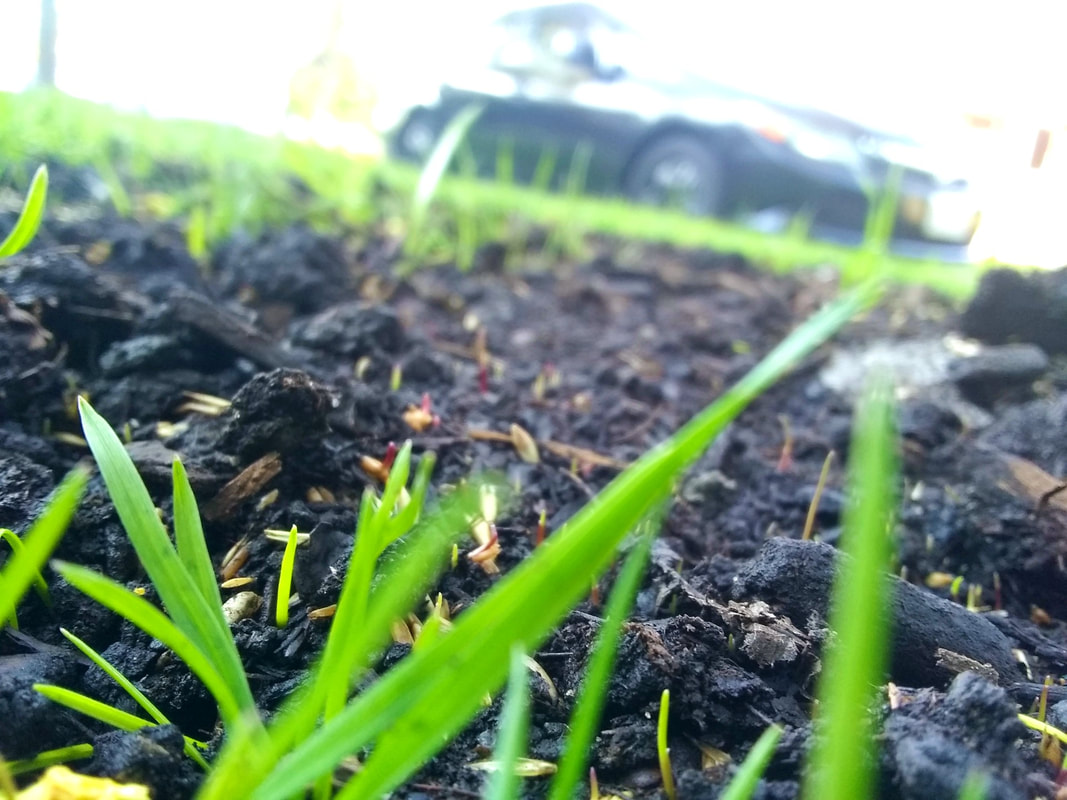
DirtEasiest photo I have taken thus far. Little set up, close up picture of dark rich dirt and grass. I could have been more inspired or taken more time on it but honestly, dirt is simple. I tried to get that across. I just made the dirt darker in order to contrast with the grass and light better. The sky is mostly a void of white, not entirely sure if that helps or degrades the photo. I like how it helps solely focus on the dirt so I'm fine with it.
|
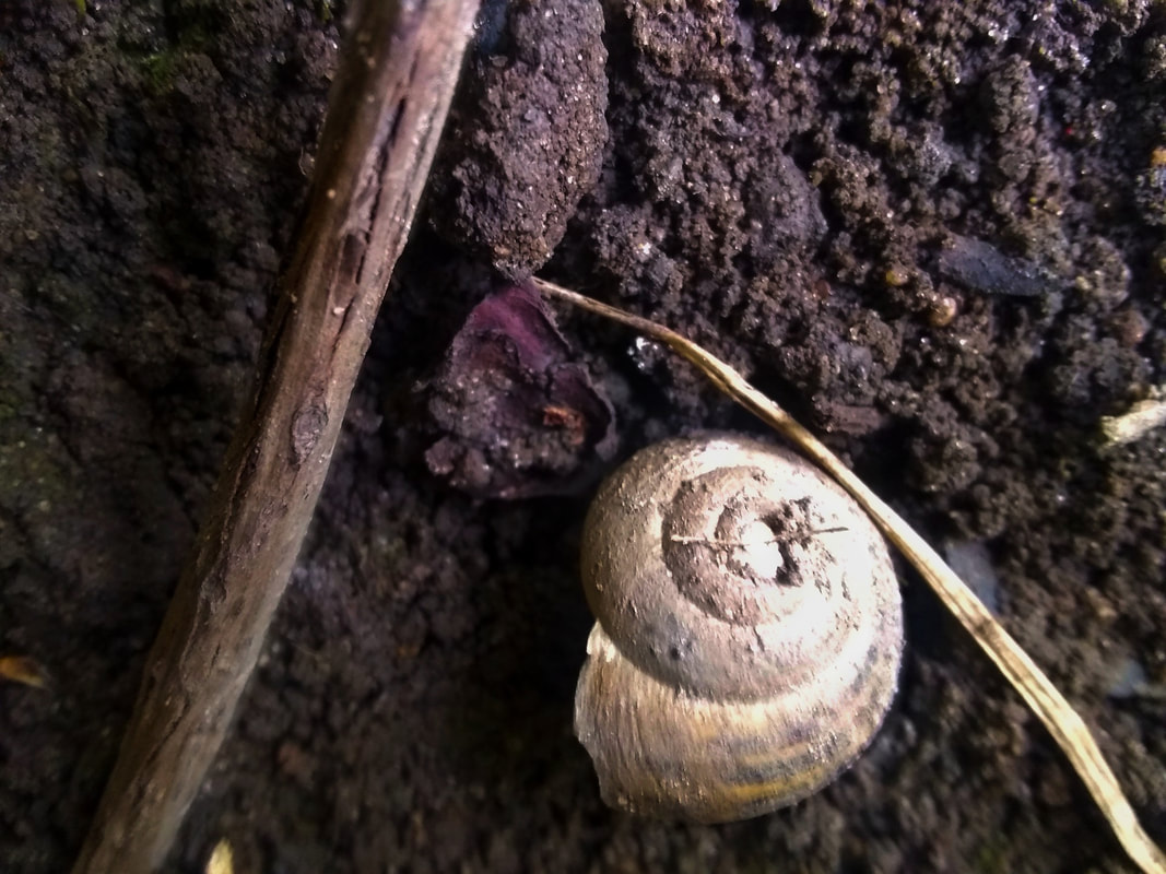
BugI could not find a bug for the life of me. I went to the park my backyard, downtown, all around my neighborhood. I finally caved and just found this shell under some rocks in my backyard. This is the closest I was gonna get. I had trouble editing because the light was so heavy on the shell. I just tried to bring out the details on the shall and make some parts darker for contrast. At least the browns and blacks of the dirt and twigs gives a buggy feel and helps the shell stand out.
|
|
|
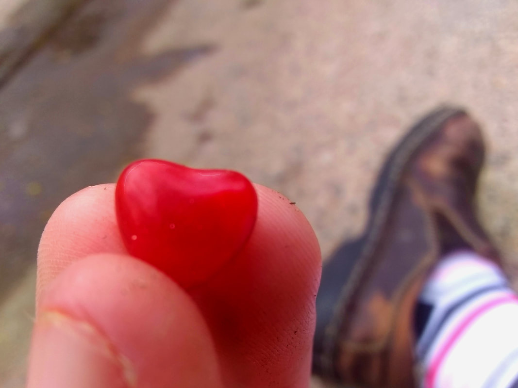
Shallow Depth of FieldThis composition is simple and there is limited color. The limited color helps the heart and shoe stand out/ contrast each other far better. I just sat in my backstreet alleyway next to a puddle. I put my fingers and the candy heart in focus for a shallow depth of field affect and put my shoe and sock in the background to greater help that affect. and put more into the composition. I added some highlights and shadows to the heart and my finger to help it subtly stand out. Simple and nice to look at.
|
Glasses and Bottles
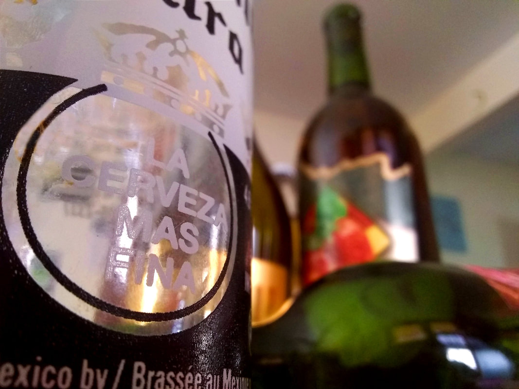
La CervezaI tried to create variety in my camera angles, this one is low looking up. I created a shallow depth of field with one bottle while other bottles are in the background. I laid one bottle out behind the in focus one to give some variety in lines and fill in the background more evenly. I like the contrast with the white see-through bottle and the full green and brown out of focus ones. While editing I had to edit out a gross hair stuck to the see through bottle with the clone stamp tool. Overall I just increased the contrast and made the temperature warmer.
|
|
|
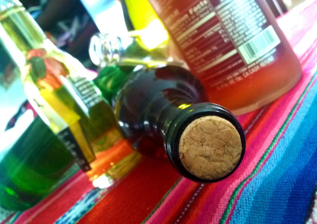
Toppled BottlesThis angle is looking along a horizontally placed bottle. Instead of having the glasses all standard placed upwards I laid some on top of each other to create a more dynamic composition. I only slightly did a shallow depth of field on the cork of the bottle. I put the see through bottle in the middle so the light would catch it. I quite like the angle and its fun to play around with composition. I sharpened the cork for more detail in editing and made the highlights brighter.
|
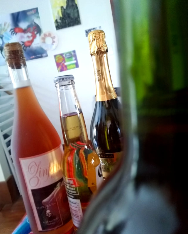
3 BottlesThis angle is high looking slightly downwards. I tried to create a shallow depth of field with the three bottles in the back and have a blurry green bottle in the foreground. I actually did something slightly new in editing and blurred out the fence and pictures in the background to help the three bottles stand out. I had the green bottle take up 1/3 vertically for the rule of thirds composition. I tried to put the shortest bottle in the middle so your eyes can have a better more organized journey. I put the reddish orange bottle at the end when I should have put the green one to better contrast the background and round out the image more. Overall I enjoy this image though.
|
|
Forced Perspective
|
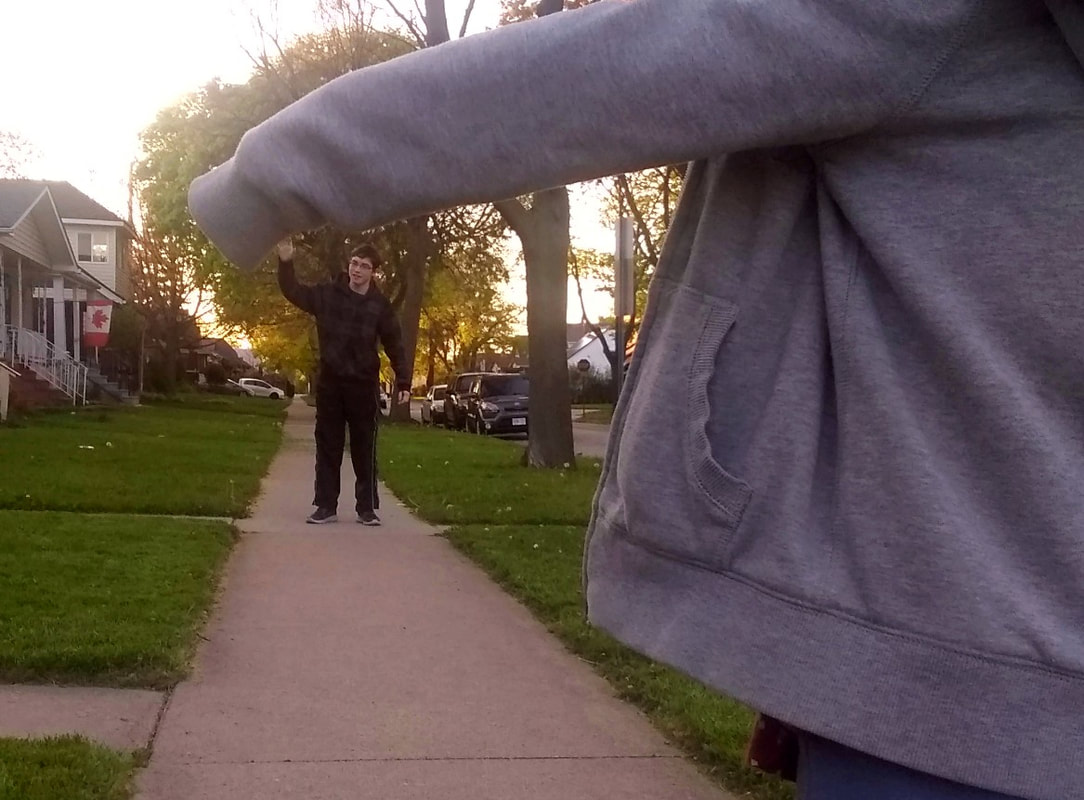
Tiny High 5I am incredibly appreciative of my siblings cooperation with this small photo shoot. I had Ethan move further down the side walk to create the illusion of my little sister towering over my brother Ethan for a monster sized high 5. If my sisters hand was in view it would probably be a more passable illusion but I didn't want to boss them around after asking them to do all of this for me. I tried to make the sky less unbearable and make Ethan stand out in editing.
|
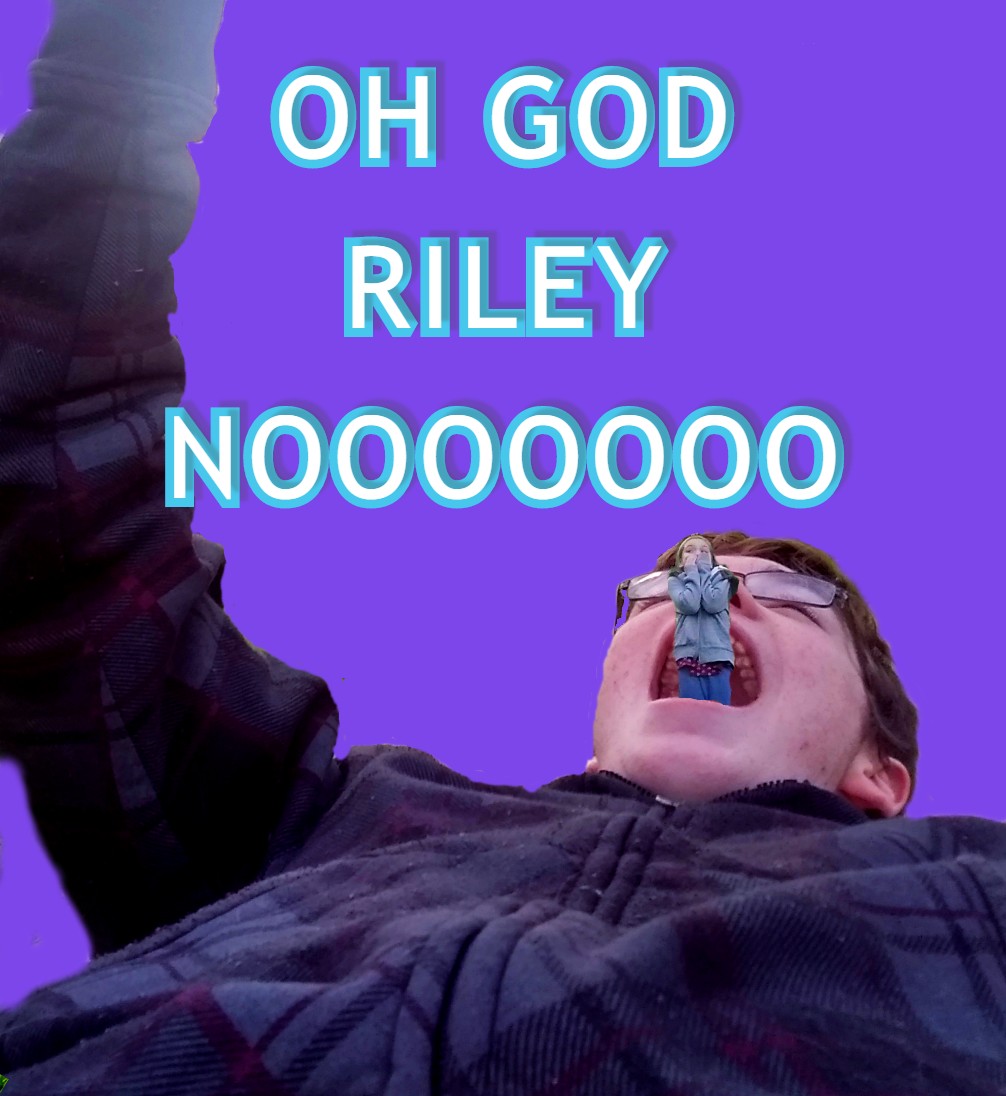
Oh No!I know that this photo is heavily edited but gosh darn I enjoy this one much more than the original I took. I cut Riley's legs off and moved her image over Ethan's and because my forced perspective pictures illusion of Riley being smaller than Ethan this edit actually works. The blue and purple work well off of each other and helps make the illusion stand out. Though heavily edited this image still gives me a laugh.
|
|
|
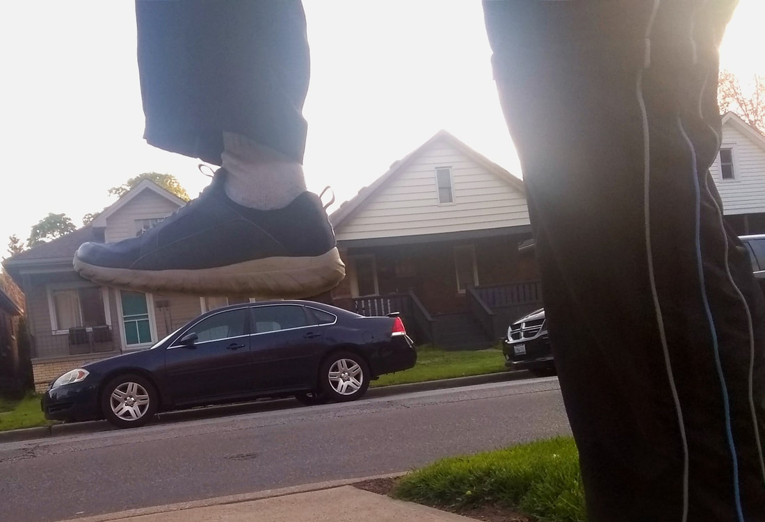
Goomba Stomp a CarI tried to make it look as if Ethan was going to step on the car as a giant. Not super creative but its there. The color and lighting is definitely in need of work but I thought if Ethan's foot lined up with the car it would pass and look pretty ok.
|
